
Applying Minimalism in The Design of Health Literacy Materials
Applying Minimalism in The Design of Health Literacy Materials
Less Is More

Hit the like button on this post, if you have ever come across a flyer or poster that had too many texts of various fonts and sizes clustered together, making it harder to grasp the information.
Or you can just like this post if you have come across a graphic design with many elements that left you more confused.
Did you notice that designs like the above are more common in flyers designed for scientific conferences? Theme, sub-theme, chief host, speakers, moderators, date, time, payment details, all lumped together in a small-sized flyer.
Whether it is a gathering of researchers educating their colleagues, or communicating science to meet the streets, in an age of information overload and sensory bombardment, it is the simplicity, clarity, and elegance of minimalist graphic designs that have gained prominence and captivated audiences.
Minimalism is more than just a design trend; it is a philosophy that embodies the notion that less is more. With its power to evocatively communicate, minimalism has become the preferred style for conveying messages visually, allowing for the creation of compelling visual stories. Here’s why:
To help your audience distill the essence of the visual story: By eliminating clutter, excessive details, or unnecessary embellishments, we focus on highlighting what truly matters. This approach streamlines the visual narrative, allowing the message to take center stage. Minimalism ensures that the audience grasps the core concept effortlessly, creating an immediate and lasting impact.
For aesthetic appeal: The elegance of minimalist designs lies in its visual appeal. By employing clean lines, enough white space within and between texts, words and other elements, and restrained color palettes, minimalist designs exude a sense of sophistication and timeless beauty. The harmony between shapes or fonts evokes a sense of calm, allowing the audience to engage more deeply with the design and the story being told.
To foster emotional connection: Using a less-is-more approach in designing visual health literacy or learning materials has an innate ability to evoke emotions, reduce distractions, encourage viewer participation and interpretation, and become a conduit for emotional storytelling, leaving a lasting impression.
For supporting effective communication: If everything is important in a flyer nothing becomes important. Clarity and communication often go hand in hand. With minimalism, the visuals are stripped down to the essential elements, ensuring a clear and coherent message. it guides the audience's attention, providing a seamless flow of information. The focus on simplicity enhances the legibility and comprehension of the design, making it versatile for various media platforms and audiences.
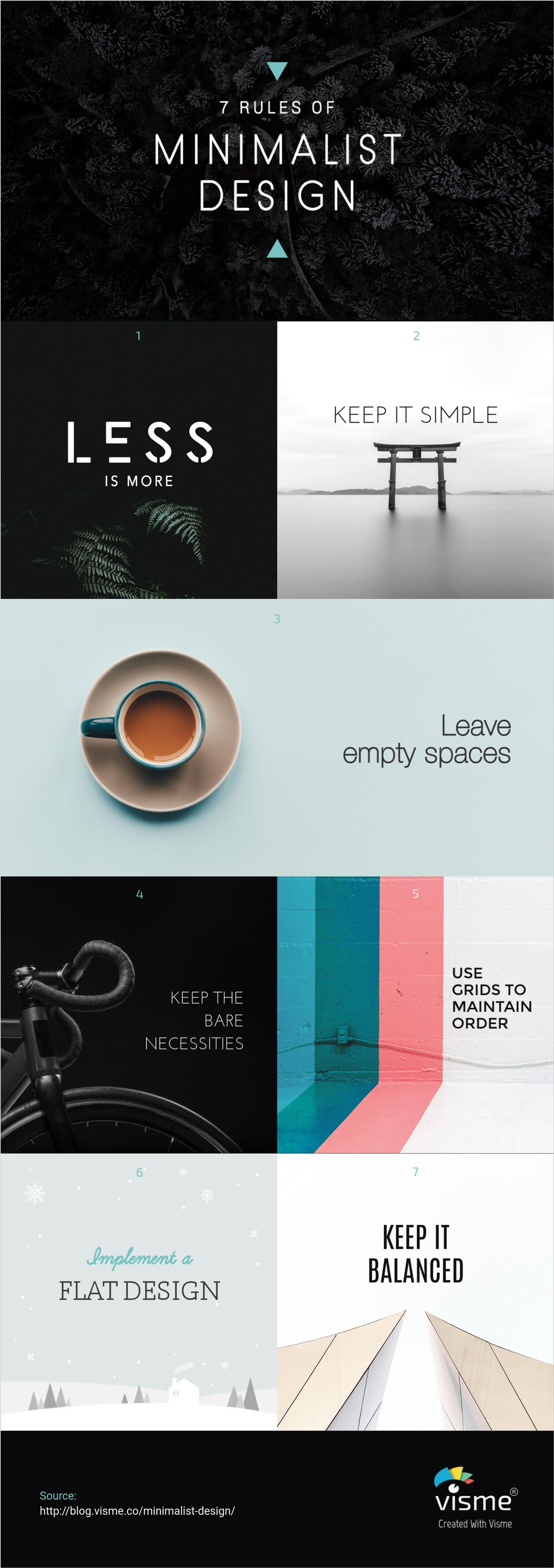
Thinking of working on an event flyer? Here are a few rules to remember/apply when using the minimalism principle in your graphics
Always remember that less is more, give your audience one thing to pick out per design frame. This will work to make your message memorable and easy to grasp.
Keep it simple
Leave empty spaces between elements. If every element look like they’re too close together, your message may be lost to the viewer
Use only the bare necessities
Keep it balanced. Used colors moderately. Don’t make it a color riot.
Use grids (i.e. rulers in the design panel) to maintain order so that objects and elements are well aligned.
Minimalism has emerged as the epitome of beauty in graphic design and visual storytelling due to its ability to distill complex ideas, its aesthetic appeal, emotional resonance, effective communication, and enduring simplicity. By embracing this approach, designers can create visual health literacy materials that leave a lasting impact, captivate, and connect with the audiences.
Further Reading:
New York Film Academy: Mastering the Art of Minimalist Graphic Design
Photutorial: Minimalism in Graphic Design